 “History is not about the facts. It is about the context and who is telling the story.” —Prof. Milton Fine.
"Who controls the past controls the future: who controls the present controls the past." –– George Orwell in his novel "1984."
"Whoever doubts the exclusive guilt of Germany for the Second World War destroys the foundation of post–war politics." –– Prof. Theodor Eschenberg, Rector, the University of Tübingen.
"If we have our own why in life, we shall get along with almost any how." – Friedrich Nietzsche
POSTER GALLERY --view
over 500 German film
original posters between
1927–1954 from
Germany and from
many Axis and Neutral countries
across Europe!
Note! Posters in the Poster Gallery are PERMANENT
acquisitions which are NOT FOR SALE!! ONLY the
posters listed in our POSTER STORE are for sale.
(They have a price and order button to use.)
Film Posters – Demands on an
important means of film advertising.
This Third Reich article on film posters appeared in the Film–Kurier Tageszeitung supplement, Saturday, 24 August 1940. Nr. 198. The article was written by Georg Herzberg, one of Germany's most influential film journalists and Editor of the national film newspaper published in Berlin until late October 1944, and then superceeded by the Film–Nachrichten newspaper he also edited until 30 March 1945.
We are pleased to provide this translation:
The Film Poster – Demands on an important means of film advertising
The Film–Kurier Tageszeitung supplement, Saturday, 24 August 1940. Nr. 198
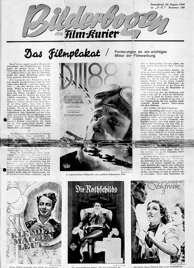
Of all the means of film advertising, the poster is the one that worries the advertising managers of the distribution companies the most. A good poster can be of great use for the exploitation of a film, but the difficulties in its production give it a certain rarity value. The task of the poster is to give the mostly unprepared eye of the passerby a concept - and a positive one at that - of the values of a film. If the audience has only experienced a few times that the posters unfairly promise more than the film delivers, then they will no longer pay any attention to these deceptive lures. It is worth remembering the youthful years of film, when the producers of sensational films basically depicted all conceivable events in the poster, without regard to the film content, and for the sake of simplicity used standard posters for serial films, in which only the titles were changed. Soon even the fourteen-year-olds got behind this twist.
So the poster should correspond to the content and values of a film. It doesn't have to tell everything, it must not spoil the suspense by revealing the final situation, it should announce conflicts but not pose any pictorial riddles to the viewer. The more clearly the poster says what needs to be said, the better it is.
If the outsider celebrates these promotional achievements, he will consider it a self-evident prerequisite that the creators of a film poster - first and foremost the advertising director and the illustrator - are precisely informed about a film. Neither the script (which is so often changed in the studio, in the editing room and by the censors), nor a synopsis (which often distorts the spirit of a film), nor even an extensive set of photos can provide this information, but only the finished film.
I can see the insiders smiling. As if there has already been such a thing, since the publicity people can wait so long with their work until the film is finished.
As if the entire film advertisement does not have to be available weeks before the censorship, so that the film theatres, which start immediately after the approval of the film review board, have the possibility of pre-propaganda.
However utopian the demand may sound that the work of the advertising experts should only begin with the finished film, it nevertheless seems to us to be a prerequisite for a truly thorough reform of our film advertising in all areas.
Film advertising
But let us stay with the film poster.
Today, in most cases, it is produced in the following way: the advertising manager, who has a precise but always incomplete idea of the film based on the script, the available photos, and at best after viewing a few hundred metres of film, racks his brains while the film is still being shot, or at the latest during the first editing days of a film, as to which motifs could be chosen for the posters.
Finally, he calls a poster painter to him and, after a brief presentation of the film's content and with the help of photos, tries to inspire him with his ideas. Under these circumstances, the artist, who lacks any personal contact with the film, has no choice but to stick as closely as possible to the ideas of his client.
In this way, a moment is devalued from the outset that could be of decisive importance for the creation of a good poster, namely the creative collaboration of the usually very experienced commercial artist. As things stand, it is very difficult for him to use his own thoughts, no matter how valuable they may be. For his ignorance of film prohibits him from taking even one step off the path laid out for him.
Conversely, the mental preliminary work for a poster would have to be done. The draughtsman and the advertising director would have to be able to sit down in the screening room and see the finished film. Then it would be the draughtsman's job to make his suggestions and the advertising manager's job to coordinate his own thoughts and any guidelines given to him with the contractor's suggestions.
It should not be denied that in the manner described here, many good and appropriate posters have been produced in the manner described here. But these valuable results were by no means eliminated by work on the finished film, but many inadequate solutions were. Film forbids to stray even one step from the path laid out for it. Conversely, the mental preliminary work for a poster would have to be done.
The opinions of the people involved, such as the advertising director, the illustrator and the artist, differ as to what a poster for a particular film should contain. Draughtsman. Distribution agent,.producer. Star and distribution theatre owner - are usually far apart. We will discuss this in detail elsewhere, as far too many people have a say in the production of the propaganda material. This applies first and foremost to the poster.
Apart from the above-mentioned, another influences the poster: it is the so-called public taste. It is the shield behind which all people who themselves have no judgement and no good taste hide away. Who doesn't know the saying: "Personally, I like the poster, but the audience in Crimmitschau…” The speaker of such words has never seen Crimmitschau.
I have to stop making the defenceless public responsible for all the tastelessness that they don't want to represent themselves but think is commercially viable. Fortunately, the film industry is not the only one that advertises through posters. Other industries do it too, and with undeniable success. And these industries, which do not want to advertise a cultural asset, but a cigarette or toothpaste, use impeccable, sometimes even artistically high-quality posters. And they don't do badly. The same audience that willingly follows these tasteful posters is suddenly supposed to narrow the focus of the film to turn-of-the-century trash? It is defenselessly exposed to this suspicion.
All attempts to prove this notorious public taste do not stand up to scrutiny. If a distributor has a good poster and a disputable, even kitschy, gaudy, overloaded poster produced for the same film, and the bad poster is demanded by the theatre owners, while the good one is left lying around, then the theatre owners and the advertising agents are responsible for this and not the audience, which has not been asked and cannot be asked.
But one thing must also be said to justify the men in the film theatre practice: We can't do anything with posters that pay for their unassailability with boredom, which clearly show that those responsible for them have renounced every bold composition, every enticing colour, every attempt at film interpretation out of fear of their own courage. Water soups don't spoil anyone's stomach, but they don't taste good either. And a poster should taste good, namely to the eyes of the visitor to be woven. Art and effectiveness must be brought to a common denominator. Even if it costs more, much more time and money than before.
There are films for which it is a pleasure to propose and draw posters and those whose plot and title give advertisers no good ideas. Usually this is a bad omen for the film. If the advertising experts, who know all the tricks of the trade, don't know what to do with a film, the audience usually feels the same way.
This starts with the title. If a title is colourless and meaningless or bears no intrinsic relation to the film's action, this is the first thing that comes to light when the advertising material is produced.
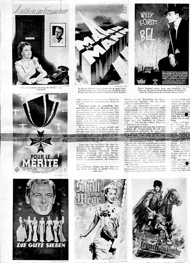
Tidbits for the advertising manager are film titles that outline the content and mood of a film without giving away details. These include proper names such as The "Three Codonas".,"The Rothschilds," "Bismarck" and similar. But titles such as "Opera Ball", "Motherly Love", "The Paradise of Bachelors", "The Model Husband" or "My Daughter Won't Do That" also have a chance in their favour from the outset, which can also be used in the poster.
Private names as film titles can be suitable for posters if they are to be illustrated with well-known stars. So Paula Wessel as "Maria Ilona", Jenny Jugo as , "Anette". Brigitte Horney as "Anna Favetti". Connections such as Willy Birgel - "The Governor" , Emil Jannings - "Robert Koch", Hans Alber - "Trenck", Heinrich George - "The Postmaster,” Ilse Werner- "Fräulen" are also to be portrayed in an effective way.
On the other hand, titles that are so blurred that they could fit every other film are feared. This applies first and foremost to the overused word love.
Title and drawing must be in harmony with each other - graphically and in terms of content. Once upon a time there was a very capable painter who delivered captivating designs - but always without lettering. If, after some urging, he added the title - he was not unhappy to see a colleague engage in what he considered to be an inferior activity - then the poster was often suddenly no longer as beautiful as before. The film titles, however, are not a necessary evil, but rather co-determining for the fleeting passer-by to preserve in his brain, otherwise he would laugh at the wrong film or feel troubled.
For the image design of a poster, the obvious thing seems to be to show the main actor or actors in a scene of the film. But the obvious is not always the best. Especially not if you limit yourself to the heads of the lovers or the happy ending, because therein lies the danger of stencilling.
Things get pretty bad when an attempt is made to put the entire cast of a film on the poster - a demand that is often made by distributors in the case of comedy films. Comedy stars like Grethe Weiser, Theo Lingen or Hans Moser then appear in ghostly colours unmotivated in the background. When Adele Sandrock was still alive and filming, she gave many a poster artist a headache.
What is to be depicted can only ever be answered by the film under discussion. There are no recipes here. Only pointers to the pitfalls that are most often built for good taste and advertising impact.
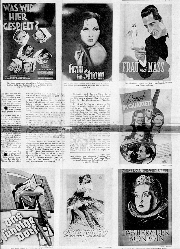
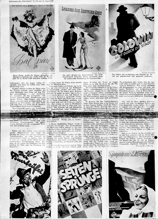
To accompany this article, we are publishing a number of what we consider to be well-done poster examples. They may show that one can reach one's goal in very different ways.
If we finally have a satisfactory poster design and if the printer has had the necessary time and the technical preconditions to turn the design into a poster of equal quality, then it is still quite a long way to the best possible presentation of this poster to the eyes of the public from Königsberg to Trier and from Flensburg to Klagenfurt.
The theatre owner can also sin against the poster. We still find posters that are lovelessly and superficially tacked to boards under lighting conditions that rob the poster of any effect. In 1940 it should be a matter of course that posters are displayed in clean frames. If they are exposed to wind and weather, they should be protected by glass panes.
The poster must always be visible as a whole. It should not be squeezed into photo boxes, nor should it be folded or crumpled as the artist sees fit. The artist has thought about the division of the space.
Unfortunately, in many cities the film poster is only used in and in front of the cinema. The display columns or public poster spaces are too often left unused. There are several reasons for this.
1. our film posters size 6 are not Din format. So for Din-format billboards, they either have to be trimmed or the theatre owner has to pay for an oversized space that is not needed at all. If our posters are radically changed to Din format, the poster frames purchased by the theatres at great expense can no longer be used. Producing two formals is not financially feasible.
2. In many cities, the price of posters is too high to allow the theatres to advertise generously since the cost of the posters themselves is not insignificant.
The enemy of the film poster is the over–sticker. Announcements such as "From Tuesday", "From Friday", "Second week", and "Extended due to success" should generally not be placed on the posters but outside the poster frame. They should be neatly and attractively written.
In rooms used for pre-announcements of new films, i.e. in foyers and corridors, posters often pile up in a disturbing way. Especially here, the poster frames should be designed in such a way that they give each poster a certain sense of purpose. Sufficient space must also be provided. It is better to have one poster less than to have the other one overwhelmed. With your own intuition, you can also coordinate the colours and motifs of the posters. Two announcements with sensational content do not necessarily need to hang next to each other. These are minor details. But they distinguish the well-run film theatre from the "cinema". Putting up advertisements is too important a job to be done by the ushers in the late evening before the changeover day.
Not every poster rented by the distributors fits into every theatre. Often enough, the distributor has another poster produced in addition to a sophisticated one, which deliberately advertises the film in a somewhat cruder form. It is up to the individual theatre owner or manager to make the choice himself and not leave it to the staff. After all, what use are all the velvet and silk coverings, all the expensive precious woods and hand-forged lighting fixtures if the same advertising is done in these rooms as in a third performance theatre with the lowest ticket price that has just been allowed?
There has been a lot of discussion about how many different posters should be produced per film. Today it is usually two or even three. It would mean a concentration of propaganda if one could get rid of this multiplicity and use only one poster at a time - but then of course a particularly effective one. Any advertising expert will confirm that it is very difficult to produce two really good posters for a film. Once an ideal poster has been found, the forced second design can only blur, if not diminish, the favourable impression of the first. We therefore support the efforts to get by with one poster per film.
The fact that our posters contain far too much text on average, that the false ambition of actors, co-creators and companies overloads the posters with text, is a chapter in itself. It will be dealt with in detail in the context of our further considerations on film propaganda.
-- Georg Herzberg
Translation © 2023 by German Films Dot Net.
We are indebted to Joel Nelson for donating this special film poster Bilderbogen supplement from the Film–Kurier Tageszeitung to The William Gillespie Collection, Sydney.